
True World Foods UK
True World Foods UK recently redesigned their website to enhance their brand design and improve the user experience. The redesign emphasizes their expertise and reliability as a premium Japanese seafood supplier.
Completion Date
06/04/2025
Category
Brand Identity & website
Sector
Branding / Web Design & Publishing / Printing


Key features in terms of brand design:
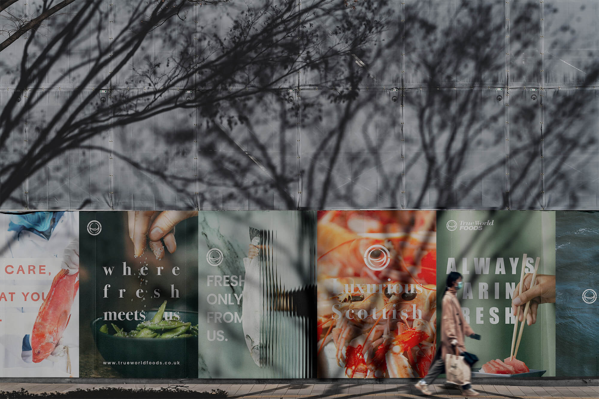
Consistent brand message: The slogan ‘Premium Japanese seafood supplier with an ocean of expertise’ is used throughout the website to reinforce the brand image of expertise and quality.
Enhanced visual identity
Using luxurious seafood images to visually convey the freshness and quality of their products, and using sophisticated design elements to highlight the brand’s premium image.
Improved user experience
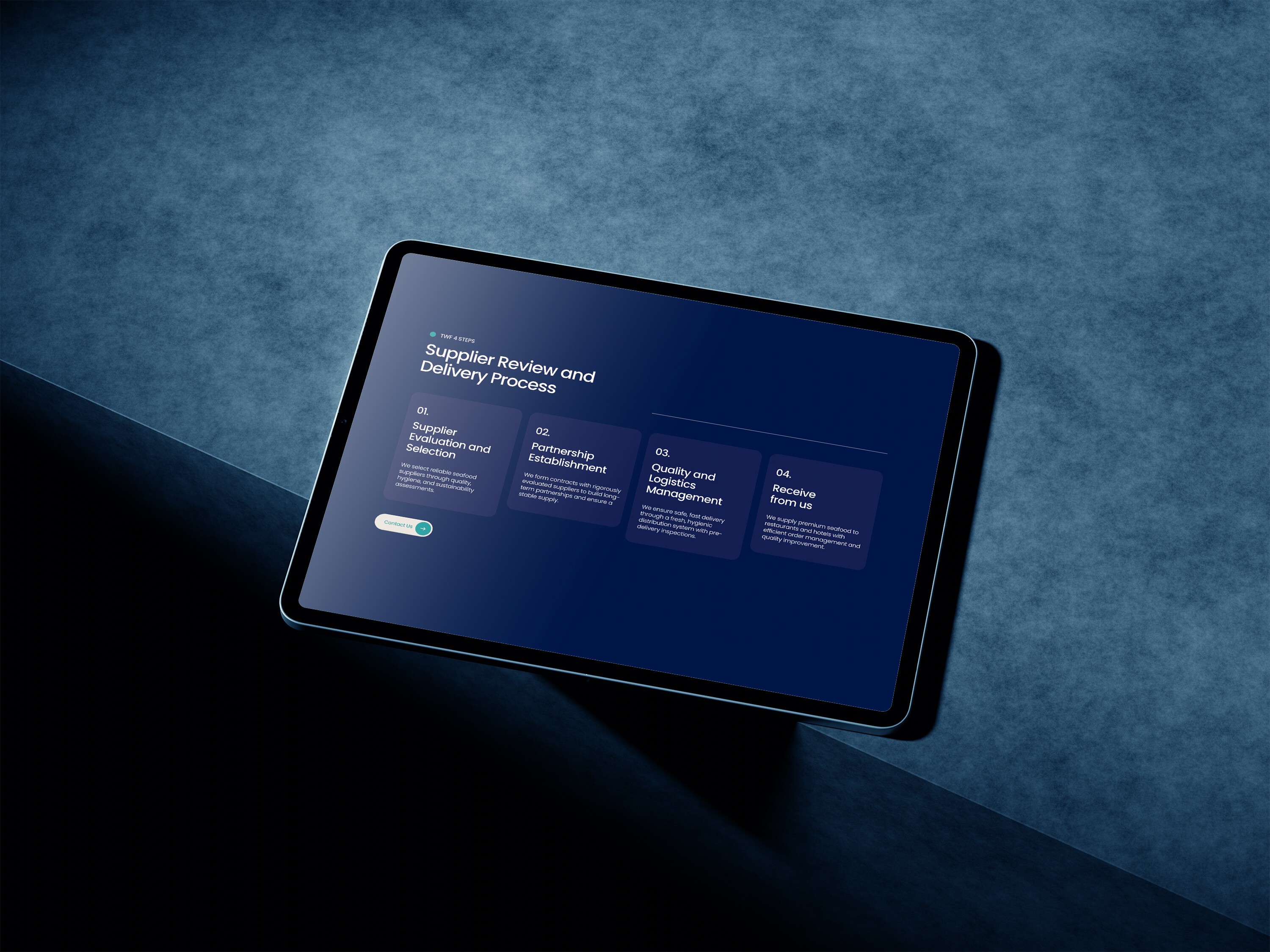
Added features such as a product catalogue and credit application download to make it easier for visitors to find and use the information they need.
These website redesigns effectively communicate True World Foods UK’s brand values and help build trust with customers.
UX (User Experience) Perspective
Clear Brand Message Delivery
The main visual and text (“Premium Seafood, Chosen by World-Class Restaurants”) clearly grab the user’s attention and immediately convey the brand’s core values (premium seafood, reliability, expertise).
Simple and intuitive information structure
The top navigation is neatly organized with “Who We Are,” “Our Products,” and “Sustainability,” allowing users to quickly access the information they want.
Use of CTA (Call to Action)
The elements that lead to actual actions, such as “Contact Us,” “Credit Application,” and “Download Catalog,” are clearly placed, making it effective in terms of driving customer conversion.
Loading speed and responsiveness
The page transition is fast and works well on various devices such as mobile/tablet.


UI (User Interface) Perspective
Visual-centered design
Using high-resolution product images and partner brand logos, it increases reliability and intuitively expresses the freshness and quality of seafood.
Tone and Manner
The colors are centered on blue to express the cleanliness and freshness of seafood. Stylish and clean typography and margin design create a luxurious atmosphere.
Consistent component design
Design elements such as buttons, card layouts, and section titles are maintained consistently, contributing to strengthening the brand identity.
Accessibility
Basic accessibility (brightness contrast, text size, etc.) was considered.
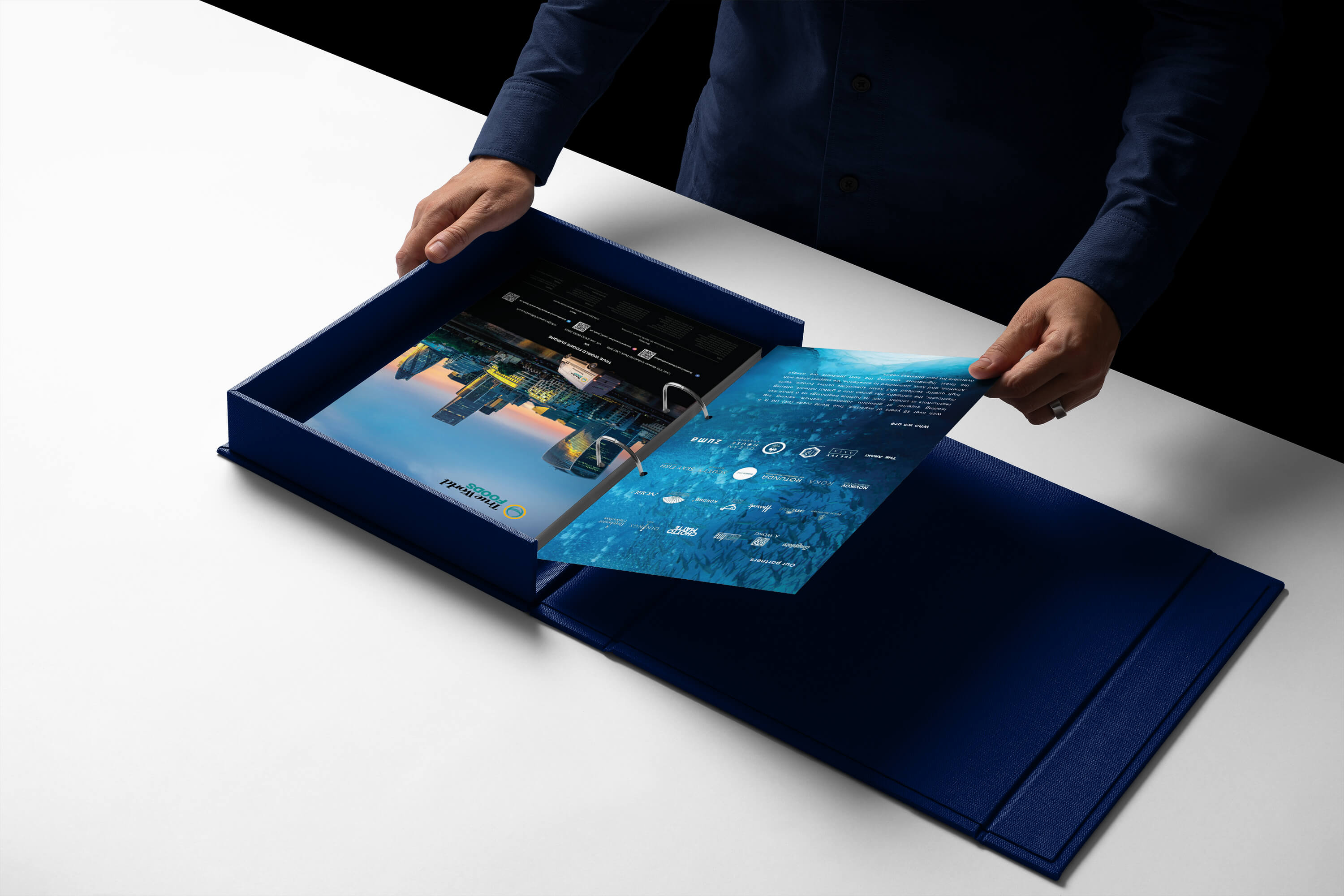


Deliverables
Branding identity, booklet, digital mockups, website and promotion goods
Credits
Charlie Yoon
