
Boldly Go

The Boldly Go website demonstrates a well-executed balance of clarity, structure, and professional tone — a fitting digital identity for a company operating at the intersection of biotech and business innovation. From its initial impression to its navigational simplicity, the site delivers a focused and user-centric experience.
Completion Date
03/04/2025
Category
Brand Identity & website
Sector
Branding / Web Design & Publishing / Printing


Brand strategy
To truly innovate and make a significant impact, one must be BOLD in their pursuits, unafraid to take risks and challenge the status quo. Being curious fuels the desire to explore new ideas, environments, and concepts, pushing the boundaries of what is known. This exploration leads to a deeper understanding, allowing individuals and organizations to analyse their findings critically. Through this process, they can grow, evolving and improving continuously based on their newfound insights and knowledge.
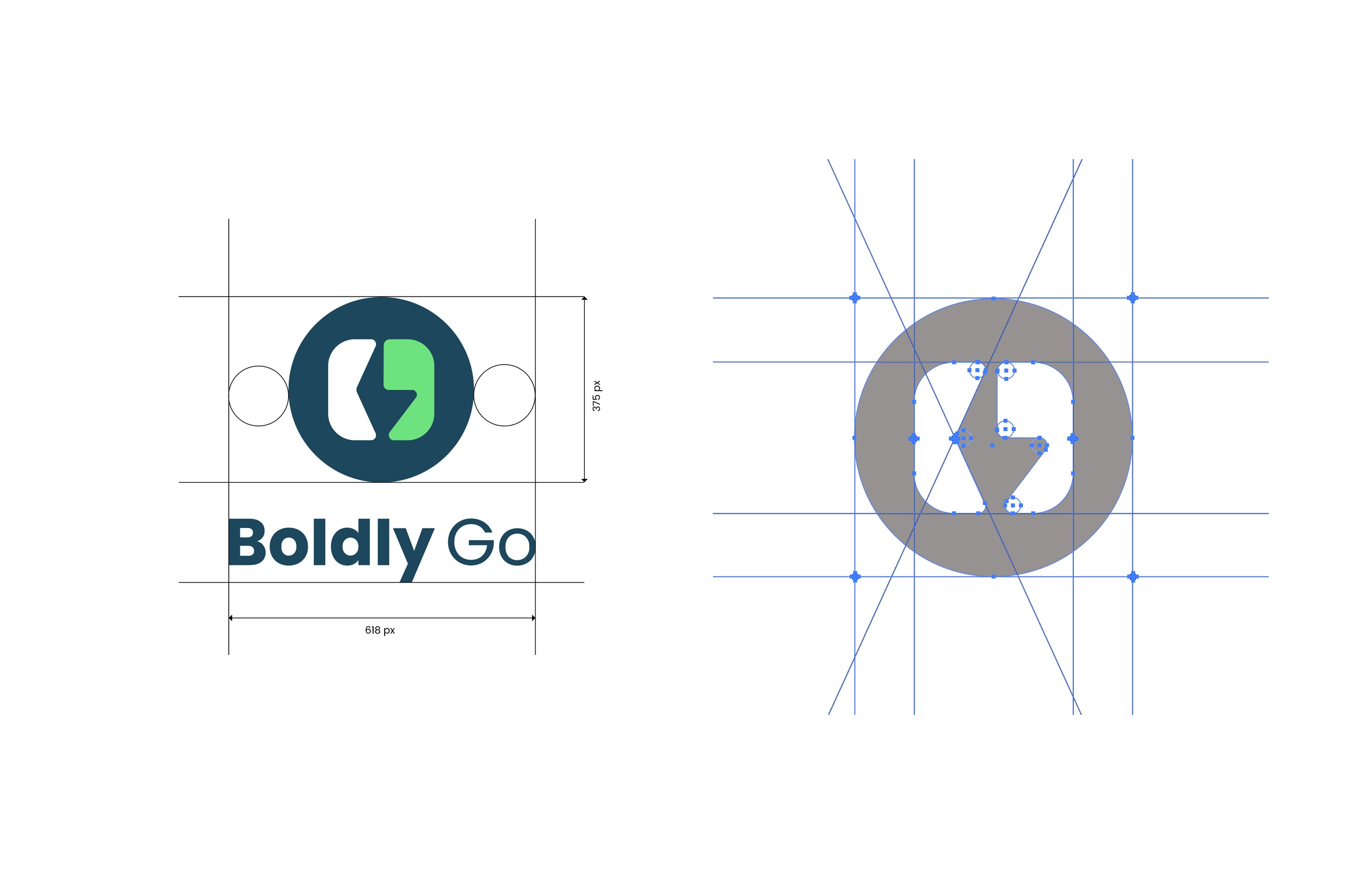
Brand logo concept background
The concept is that the central negative space created by the letters B and G represents the lightning symbol, meaning exploring the unknown world and providing new ideas.
First Impression & Visual Hierarchy
The homepage opens with a direct and compelling statement: “Accelerating growth for healthtech startups.” This headline immediately communicates the company’s mission, setting a clear tone for the rest of the experience. The layout supports this message with a clean visual hierarchy — bold headlines, concise supporting text, and well-defined sections guide the user intuitively through the content.
Color System & Typography
Visually, the site leans into a modern and trustworthy aesthetic. The color palette — grounded in calm, professional tones with subtle contrast — reinforces the credibility expected in the healthtech space. The consistent use of a clean, sans-serif typeface enhances legibility while supporting a sleek, forward-thinking tone. Contrast between headers and body text creates a clear reading flow and supports visual hierarchy.


Responsive Design & Performance
The site is fully responsive, offering a consistent and optimized experience across desktop, tablet, and mobile devices. The layout adjusts gracefully, and interactive elements remain usable across screen sizes — a must for any modern business website. Performance is also clearly a priority; optimized imagery and efficient code structure contribute to fast load times, improving both SEO and user retention.
Content Structure & Communication
Each service is presented with clarity: Fractional COO, Fractional CPO, and USA Market Entry are each given their own space, with brief but effective summaries and direct CTAs like “Find out more.” This segmented approach makes it easy for visitors to quickly understand offerings and dive deeper as needed.
The inclusion of client testimonials further enhances credibility. By showcasing real feedback, the site adds a layer of trust and relatability that can be especially impactful for first-time visitors or potential partners.


Deliverables
Branding identity, booklet, digital mockups, website and promotion goods
Credits
Charlie Yoon

